Followers

Monday 24 February 2020

The others have fluff…


Sharing a card featuring one of the awesome owls from the Owl Rather Be You set by Gerda Steiner Designs.


My layout follows the current sketch from CAS(E) this Sketch.  Now I am a total enamel dot hoarder, I buy them all the time in all sorts of colours thinking they will be the perfect embellies for male cards.  But you know they just go straight in my enamel dot box and when I make a male card, I somehow don’t think to use them or figure my card doesn’t need any embellies.  But not this time, no siree.  I saw this sketch and thought I can totally enamel dot the heck out of it and that’s exactly what I did ~ think it worked out pretty awesome too!

Now the enamel dot colour choice and the palette for my card comes from the current inspiration cookies from If You Give a Crafter a Cookie.  It’s really hard to tell because the sentiment is pretty small (even on the real card) but I also did the printed part in a matching red with blue dots pattern as one of the candle cookies from the picture.  My ‘birthday’ chippie (one of the last ever order from Make it Crafty, still in mourning over Zoe closing down and the end of the best every chippies in the history of crafting!) was done in gold embossing powder to be the slight gold accent like the flames on the candle.  Unfortunately, when I went to colour up my white enamel dots in gold to add a few of them as accents I found my Gold Alcohol Mixative had gone to swamp water (basically all that’s coming out the bottle now is horrid green liquid) so I had to use rose gold.  Not a great match but I’m telling you now gold glitter brush markers don’t dry over enamel dots and I really didn’t want to plastic fume myself trying to emboss the enamel dots.

But with my embossing on my chippie I am also entering my card over at The Male Room as hopefully this card looks suitably masculine too.  It better, because it’s going to a male friend who told our friend group that we could go to lunch for pretty much any reason other than his birthday, hence the sentiment and the rather unimpressed looking owl on the card.

Ingredients:
Copics
Feathers BV0000, YR31, YR20, YR30 | B60, E59, E57, E23 | E99, YR24, YR21 & PC938, PC943, PC945, PC947, PC1083
Eyes V000, Y13, YR31, YR30
Beak 100, C8, C4
Feet BV25, BV23, BV20 & PC1054, PC1060
Chalks & Powders etc
Stampendous! Embossing Powder ~ Detail Gold
Embellishments
Kraftin’ Kimmie Enamel Dots ~ Lovely Dots
Make it Crafty Chipboard Single Layered Word ~ 3" birthday
Uniquely Creative Enamel Dots ~ Aqua, Navy & White (coloured with Tim Holtz Adirondack Alcohol Ink Rose Gold Mixative)
Inks & Paints etc
Tim Holtz Distress Markers ~ Faded Jeans
Tsukineko Ink ~ VersaMark
Papers
Bazzill Card Shoppe Cardstock ~ Marshmallow
Bazzill Monochromatic Cardstock ~ Patina
House of Paper Cardstock ~ Linen Embossed White
Stampin’ Up! Cardstock ~ Dapper Denim & Real Red
Stamps
Challenges
https://casethissketch.blogspot.com/2020/02/case-this-sketch-360.html


https://themaleroomchallengeblog.blogspot.com/2020/02/challenge-130-use-embossing.html

 Thanks for stopping by!

Monday 17 February 2020

…a diamond in the rough


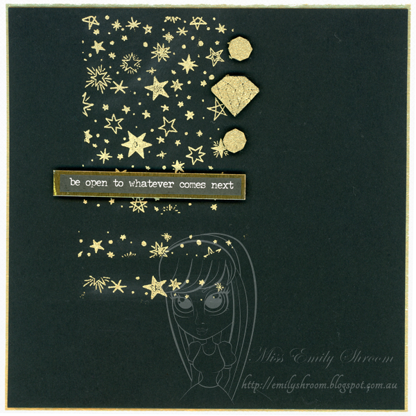
Sharing a card for one of my staff featuring the Galaxy Galore Background stamp from Whimsy Stamps and an image from the Magical Nights Messages from Hero Arts.


The layout of my card follows the current sketch at CAS(E) this Sketch.  To form the large and small rectangle elements I cut a mask out of some scrap paper and placed this over my cardstock.  I then inked up the Galaxy Galore Background stamp with VersaMark ink then sprinkled over my gold embossing powder.

To form the scalloped element I then embossed one of the diamonds from the Hero Arts’ Magical Nights Messages and fussy cut it, popping it up on a foam dot.  I did the same for one of the other diamond shapes only this time I stamped out two images and fussy cut right down to the centre shape in the diamond to create smaller shapes.

I went with all these tiny images so I could play along at Less is More for their more but still less, well, OK CAS but same same, OK so I like the contradictory sound of more but less better!  For interest I went with a gold on black colour scheme so my ‘white space’ required for it to be CAS is actually black because white space doesn’t literally mean white and hey, we’re going with opposites here (more as less etc, you get my drift, right?!).

I kept my embellies real simple and combined it with my sentiment, using one of Tim’s Small Talk stickers matted on more of his scrummy gold cardstock.  This card is actually to celebrate one of my staff getting promoted into a new team doing a different kind of work so I thought it was appropriate.  And by now you get this card isn’t following the conventional so figures I wouldnt stick a ‘congratulations’ sentiment on it.

Now my decoration is more or less sticking to one corner of the card so I’m entering it at AAA Cards.  I swung the optional twist too with my older stamps I’ve used.

Ingredients:
Chalks & Powders etc
Stampendous! Embossing Powder ~ Detail Gold
Embellishments
Tim Holtz Idea-ology Paperie Stickers ~ Small Talk
Inks & Paints etc
Tsukineko Ink ~ VersaMark
Papers
Bazzill Card Shoppe Cardstock ~ Marshmallow
Hero Hues Cardstock ~ Pitch Black
Tim Holtz Idea-ology Paperie Kraft-Stock ~ Metallic
Stamps
Challenges
https://aaacards.blogspot.com/2020/02/cas-game-159-one-corner-optional-twist.html

http://casethissketch.blogspot.com/2020/02/case-this-sketch-359.html

http://simplylessismoore.blogspot.com/2020/02/challenge-413-more-but-still-cas.html

Thanks for stopping by!

Sunday 16 February 2020

This is an environment of welcoming…


Sharing a CAS card featuring a fun image from Dr Digi called Remote Control Colin.


This is going out to a colleague who is off work recovering from surgery.  The sentiment is computer generated and references a quote from The Office, not sure that’s what he’s binging at home but he’s the right generation for that show.

Over at both Bastel-Traum and Kreativ-Tanten they are looking for get well soon cards so I am entering mine in both of their challenges.  At A Place to Start they have a simple theme of anything for a male.  This card is definitely going out to a male, hence my…um…manly man image.  Well, I’m sure the recipient will get a kick out of it anyway, even if he takes better care of himself than this gentleman, including wearing matching socks, but maybe that’s just what he does at work...!

Ingredients:
Copics & Prismacolor Pencils
Skin B60, E21, E50 & PC1026, PC1092
Hair E23 & PC938, PC944 
Singlet BV0000, YR31, YR20, YR30 
Spotted socks G99, BVo8, BV17, BV34 & 100, T10, T8 
Striped socks B32, R27, YR07, YR04 & V01, Y13, Y11 
Underpants Y28, B97, B95, B93 
Chair B66, E59, E57, E23 
Mug C6, BG49, BG45, BG11 
Remote 100, T8, T6, T4, R27, B66 
Inks & Paints etc 
Copic Multilner ~ Sepia 
Kuretake Zig Mangaka ~ Black & Sepia 
Molotow Paint Marker ~ Signal White 
Papers 
Bazzill Card Shoppe Cardstock ~ Marshmallow
Bazzill Monochromatic Cardstock ~ Brown
Cryogen Cardstock ~ Curious Metallics 
Stampin’ Up! Specialty Designer Series Paper Noble Peacock ~ Old Olive Foil 
Stamps 
Challenges 


https://bastel-traum.blogspot.com/2020/02/86-gute-besserung-get-well-soon.html


Thanks for stopping by!