
They’ve put out a DT call over at the Simply Steampunk Challenges’ site and I promised myself that if I could make a project in time I would try out. I figured if I could make a project using at least the required four images this month, given all the birthday cards and other things I’ve had to do, then I could commit to doing so each month so I could try out. Steampunks represent a real challenge for me, something out of my comfort zone so I really wanted to try as a way of expanding my crafting skills.
Well I did
it!
Deciding on my project was easy,
when I saw the latest release from Simply Betty Stamps, the Steampunk Classic Collection 6, and the range of “The Letter …” images I immediately thought of
flash cards but not like the cute ones they use to teach kids to read their
letters but grown up ones, a bit like Roald Dahl’s Revolting Rhymes. I know
Betty has a real Edgar Allan Poe thing happening so I checked these out and
found some similar references and then I asked and she confirmed these images
were Poe inspired so I had my theme. So for
my Simply Steampunk Challenges’ DT call project, I present my Poe Cards.
The first image I
used was the Wood Witch on the box lid.

So for the first one, The Letter A, the colour is aubergine (OK, so work with me here, I did the best
match given my limited Copic collection) and attire, inspired by the Steampunk
attire of the woman in the image. There
was no text in the banners on the image I received so I added some based on what I saw in the image, somewhat different to that on the image sample in store.


On to The Letter B, a brown book was the obvious choice given the bookshelf featured in the image. Again the text had dropped off my image so I made up my own, this time nothing like that on the sample.


The Letter C is getting a bit macabre and far from my usual style, it is all in crimson (the darkest shade is Crimson in the Copic range but yes, I know, the rest is rather pink!) and features a cage made to look like it has been covered in blood over time from the witch’s sacrifices.


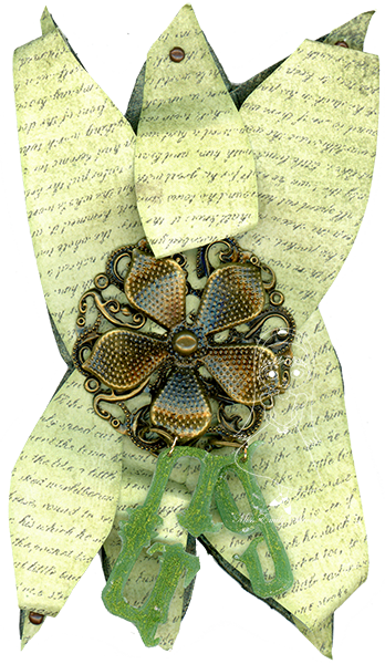
Finally we have
The Letter G, which had to be green given the image but is shaped like a flower
because grass would have been rather boring!
It did ruin the matching of colours and themes to the letters but at
least “f” is only one along from “g” in the alphabet.

And, yes, if you
think the images look a bit stretched, they are. Had to elongate them to fit the size of the
box and, therefore, cards I made.
Copics used
BV00, BV02, BV08,
BV17, BV29
C-100, colourless
blender
E30, E31, E33,
E35, E37
G000, G00, G02,
G05, G07, G28
RV21, RV23, RV29
Thanks for
stopping by and wish me luck!
Hi Emily,
ReplyDeleteThey all have a nicely warped steampunky feel. I especially like your "A" and "B" for the aged feel they have. Being fairly new to this scene I don't yet understand the perameters you have to work with, but I can imagine you putting up a whole collection (let's see the alphabet in a book!).... if your time allows. Rosalie.
OMG this are all amazing..I love the way you did the letters as the colors... I wouldn't have thought about it in that way... this is a lot of thought put into this...I am so proud of you..
ReplyDeleteGood luck on your DT call....
Hugs
Wow Great Designs love the way you think and execute!
ReplyDelete